The link below will direct you to the first draft of my house style and you'll see the changes I have made.
 |
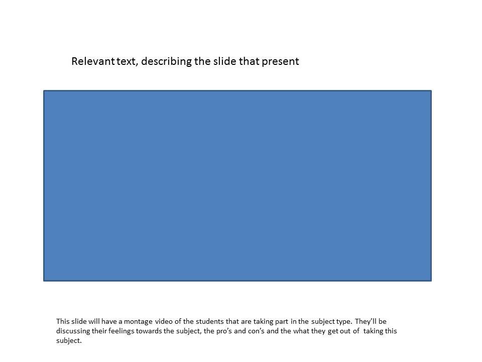
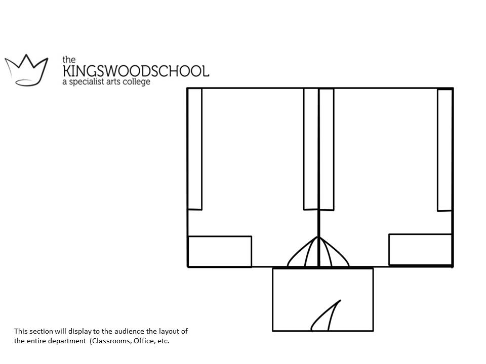
| This is a screen shot of my development of my house style, the main theme was approved rather well, but minor tweaks were required to either, created space, or edit it's appearance. I asked several of my friends so that I can receive critical assessment, this allowed me to gain several pointers to develop the original concept. Note- the following paragraphs are annotated in the picture of the slide. The first and main improvement that people insisted on is to create more space. I recognized their statement and began adjusting my house style accordingly, by removing the bottom right hand sides decorative design (the design covered too much space), re-positioning my buttons and adjusting their size measurements on the slide picture, reducing the picture sizes that would adjust depending on the slide (gallery will consist of the most images and videos. Secondly i was asked to change my text to suit the overall style of the house style, so I changed the text to Brush Script Std, which continually changed it's size to insinuate different text types the logo title is the largest font size of 20, the hyperlinks of 14 and the main body text that'll be used for information will be at a standard 12. Additionally I contrasted the colours of the text to the decorative design of Forest Green and Black, especially for the hyperlinks as i received several complaints on that they were barely visible, so this development was both a functional and decorative improvement. Finally a logo was asked for, something that represented the Media Department, so I decided that the department logo should contain a similar theme towards the school logo itself. To achieve that theme is in it's simplicity, but I also associated the logo to fit into the virtual tour as-well. By using Brush Script Std text and the use of a basic vector image to create my logo. Finally I went to the department that my department is based upon and asked for the opinions on my prototype. This needed to be done so that my representation of the Media Department is correct, they gave me the feedback on the gaps around my images, they stated that the gaps need to be more consistent (evenly spaced gaps) but the department felt that my prototype was a respectful representation of their subject. All those suggestions I took on board and to the best of my abilities and developed my first concept, which every suggestion improved my prototype signification. |